

Arctic Monkeys - Suck it and See: This CD cover shows a man with a denim sleeveless jacket on with the CD's title stitched onto the back swearing to whatever is behind him, his position makes him the focal point of the image. This gives a rebellious and not caring image of the arctic monkeys which is stereotypically what teenagers would be drawn too as they are seen as rebellious. A muscly older man is used instead of a younger one that would more likely appeal to the audience more. This may have been used to show the strength of the statement and that the music is not just for teenagers but for older people too. He is standing in a dusty parking area which looks like the middle on no where but it looks like he doesn't care where he is which makes his surroundings connote freedom and that he's adventurous and could go anywhere from there. The natural high key lighting reinforces this sense of freedom as it puts everything in a happy and positive light which creates a sense of optimism. The inlay of the CD only has the title in bold, black capital letters to make them stand out and have an impact and to keep the CD design simple.

The Vaccines - What did you Expect from the Vaccines: The cover of this CD shows a picture of a girl hugging a boy with his arm around her which is bordered with a pastel pink line to match the colour of the band name. This connotes that the music may be aimed at teenaged girls as a teenaged girl is on the front cover and the title and the border is in pink which is a popular colour for teenage girls. Also the use of a dark navy background and a light shade of pink font for the title makes it stand out more and look colourful but simple. The picture seems like a randomly chosen picture to put on the front but if you look at the songs on this album one is about a teenaged girl which this cover could be depicting in the picture. The inlay of the album shows a faded picture of the band with colourful shirts on which connotes that they are young and lively people. This picture is also important as it shows what the band look like as if to associate the people to the music they create.


Vampire Weekend - Vampire Weekend: This CD cover simply shows a chandelier over a room full of people which could be a house party. This suggests that the music is meant for teenagers and they have parties and think that friends and company is very important. The chandelier could connote their wealth or their of a high class which all connotes that their CD is important and it's to be valued. The lighting is low-key but it's soft and warm lighting which looks inviting and comfortable. It also looks like it could be a photograph from a polaroid camera which is popular among teenagers currently as it's seen as vintage along with the old fashioned chandelier. The inlay is simply a list of songs thats on the album in capitals and in bold white font. This is informative and it makes the words stand out from the worn out green colour of the background.


 Alt-J - An Awesome Wave: This CD cover literally represents the title of the CD so it doesn't have to have it on the cover. It looks like a multicoloured wave has hit on a shiny silver surface to make a piece of modern art. This makes the band look very artistic and creative connoting that this may be shown also through their music. The inlay of the CD is similar to the Vampire Weekend one where they have named all the songs on the album in capital letters to make them stand out and to emphasise them. Also this CD has made the font multicoloured which also looks artistic and matches the cover of the CD's colour.
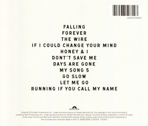
HAIM - Days Are Gone: This CD cover shows the band sitting on chairs on a patch of grass doing the same pose. This makes them look very sophisticated as they are also wearing sunglasses and the fact they're doing the same pose makes them look almost like models posing. This connotes that they are a stylish and sophisticated band who appeal to the stylish kind of person. The font is simple and the letters are capitalised and in white to stand out against the green grass. Its in the corner of the cover along with the title of the CD as they want the picture on the front to be focused on more and stand out more than the title.
No comments:
Post a Comment